Menu
August 23rd, 2021
Dolly Parton once famously said, “It costs a lot of money to look this cheap.” Dolly wasn’t just talking about her hair or her clothes; she was talking about the entire Dolly Parton brand: a sassy, good-hearted, heavily made-up country singer with big hair and a sparkly outfit that shows off her buxom figure. But I didn’t have to tell you any of that, because the moment you read “Dolly Parton,” you had an image in your head, and it’s probably pretty close to that exact description. That’s the power of branding.
You may not have as much money as Dolly Parton, and you probably don’t want to spend it cultivating a similar image for your law firm. But that doesn’t mean you can’t take a page out of Dolly’s book and understand that creating the visual aspects of your brand is an intentional process.
Lawyers generally spend less time thinking about image than entertainers do because their focus is on the substance of the work they do. But if clients are going to hire you, they need to have an idea about who you are, what you do, and why they should work with you. Good branding ensures that the idea they have is the same one you’re trying to convey, and that doesn’t happen by accident.
Two Ways to Think About Branding
There are two ideas at play when it comes to branding. One is emotional. What your audience feels when they think of your brand, what they associate your firm with, and the reputation and overall connection (whether positive or negative) that the audience has developed with your firm.
The second concept is visual. What image does your audience associate with your firm when they think of it? Is there a memorable logo that stays with them? A distinctive color that calls your firm instantly to mind? What imagery are you using on your firm’s website and other communications? Are these visual elements working together to reach the right audience and send the right message?
Both the visual and emotional impacts of branding support and feed each other. They should be given equal consideration, whether your firm is new and establishing a brand, or evolving and reconsidering its image. Let’s dive deeper into the visual details that influence a brand’s impact.
Color Your World
From the beginning of time, people have associated certain colors with certain traits. The blue hue of the sky and sea convey clarity and stability. We know the sky will be there tomorrow. We know the waters are worthy of our respect. Blue is strong. Blue is firm. Blue is reliable.
Green is natural and fresh, and we associate it with the outdoors. Green can relax and soothe. Blend it with blue’s reliability, and you can create a color palette that evokes calm, a feeling many firms want to elicit in their clients.
Red is a powerful color, associated with blood, our life force, and the heat of an intense flame. Red may trigger strong positive or negative associations, but it is never neutral. Red can do positive things for a brand; many restaurants use red in branding because it stimulates appetite. It can have negative connotations, too, like the red of a stop sign or stop light. Depending on how it is used, this vivid color can help or hurt a brand.
 Likewise, yellow can communicate either urgency or caution, and like red, can stimulate the appetite. (There’s a reason many fast food chains use these colors in combination.) Purple relays the message of royalty; perhaps that’s why Prince used it so much in his own branding that it caused him to be known as “The Purple One.” Pink, originally a color regularly used to clothe baby boys, now evokes femininity. Gray is buttoned-down, steady, conservative.
We could go on, but you get the point: humans have a strong, even visceral, reaction to color. The colors you use in branding, and whether they are muted or vivid, can make or break a prospective client’s reaction to your firm. There’s no single color or color combination that’s “best;” there’s only what’s best for your firm. A vivid orange might not work for a firm known for its conservative style and practice areas. The same color could be perfect for a cutting-edge tech law firm that prides itself on being fresh and different.
Know Your Type
Written language is an essential component of human communication. And it is communication that allows us to collaborate, achieve goals in common, and give structure to our world.
It can be easy to underestimate the impact that typography has when it comes to branding, but this element is a subtle giant when building out your firm’s brand. (Don’t believe us? Do your law firm’s marketing materials in Comic Sans and let us know how that works out.) So, how does something as simple as the appearance of print make such a huge difference?
First, some basics. A typeface is a family of fonts. This term comes from way back, when a type foundry would carefully craft a set of letter blocks, including numbers, symbols, and punctuation, and then create slight variations of those initial type blocks. These variations on the originals enabled formatting such as bolding, italicizing, etc. Type families provided a more comprehensive way of communicating in print.
Fonts were the unique sets of variations within that typeface. Similarly, the typeface family Helvetica is composed of various fonts, such as Helvetica Bold, Helvetica Italic, Helvetica Narrow, etc.
There are two primary styles of typefaces used in modern day: Serif and sans-serif. Serif fonts are the ones with a more classic look and feel, more uneven stem weights, and that have those recognizable strokes sticking out at the ends of the letter stems. Sans-serif fonts are typically more geometric, evenly weighted, cleaner when looked at up-close, and have no serifs on their ends, which is what gives them their name.
Which font style is right for your firm’s brand depends completely on the image you want to convey. If your firm wants to embody more of a classic, old-school law firm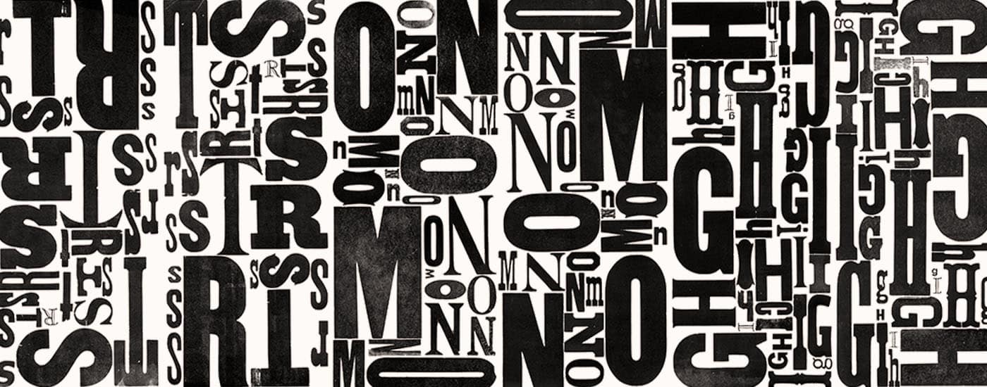 image, you’ll likely feel at home using serif fonts, generally associated with institutional, formal environments. If your firm instead wants to appeal to a demographic that is tech-savvy, with more contemporary taste in design, sans-serif will definitely be the way to go with your typography.
The examples and unique needs of each brand are too broad to list. In some instances, a mix of serif and sans-serif fonts is the best design approach. Sometimes other type styles, such as script fonts or slab fonts, might better convey an image that your audience will find appealing and inviting. And, of course, one of the most important things to consider when it comes to choosing your firm’s typography is legibility.
The late Italian designer Massimo Vignelli comically said, “There are people who think that when they write the word ‘dog’ it should bark.” A professional designer will know how to cut through the tens of thousands of mediocre typefaces to give you a typeface that will help your firm send the right visual message and evoke the feeling in your audience that you seek.
Oh, Snap(shot)
 No discussion of the visual aspects of branding is complete without talking about photography; there’s a reason it’s so often said that “a picture is worth a thousand words.” Humans are visual creatures. Images create a shared experience. A good one can help your audience see you as wise and trustworthy--a powerful advocate. A bad experience can scream to your audience, “Don’t hire this firm!” With so much on the line, how do you choose just the right photographs to convey your firm’s image?
Just as the availability of thousands of different fonts can cause “decision paralysis,” the advent of Google Images and free and paid stock imagery sites mean law firms have more image options than ever at their fingertips. That can lead to feeling overwhelmed and making poor branding choices.
Through sheer numbers of photographs, certain images have come to represent certain ideas. “Business” is represented by shaking hands and guys in suits. “Healthy” is a smiling woman eating a salad. “Success” is a collection of items that all look the same, with a single one, colored differently and positioned ahead of the rest. “Choice” is a fork in the road. “Networking” is a group of icons interconnected with lines. You get the point.
If you pick photographs that are unusual just for the sake of being different, your audience may find the imagery jarring. If you choose safe, predictable imagery, you may not make a misstep, but you could miss an opportunity to convey what sets you apart from your competitors. On your own, it’s easy to veer too far in one direction or another. If you know what kind of imagery harmonizes with your branding, and entrust a professional with the creative vision for building your brand, it becomes much easier to select images that will appeal to your audience, not confuse or bore them.
Stock photos shouldn’t be the only images that will appear on your website and marketing materials. You should also have pictures of your most important resource: your team. If online dating has taught us anything, it’s that a first impression based on a photo can induce comfort and trust or just the opposite, resulting in a left swipe. We want your audience to swipe right on your firm! How you present your team in your company photos is crucial to successful branding.
Don’t skimp on your staff photos. It’s easy to think, “All I need is a decent headshot.” Not so. No matter what your practice areas may be, you are ultimately dealing with (and being hired by) human beings. We embrace that which feels human and real. Good professional photography will make your company relatable, help kick off your relationship with potential clients, provide an instant point of recognition, and overall help ensure that your brand is much more than just words on a brochure or website.
A professional photographer will take the creative vision for your brand and capture images in settings, poses, and compositions that will help propel that creative vision even further, by humanizing it. Take the time to really look through photographer portfolios until you find the one that has plenty of samples of the overall style and image you’re seeking for your brand. The images on your website will be the first thing your audience sees; don’t let them be the last thing you think about.
The visual aspects of your brand tell your audience a lot about your firm before they ever read a single word, so be authentic and intentional in creating those details. Dolly Parton was a woman of many wise words, so we will leave you with a few more: “Find out who you are. And do it on purpose.”
The Modern Firm focuses on all aspects of branding, including the ever-crucial visual ones, when designing websites for our clients. While incorporating strong copywriting, search engine optimization, visual design that will stick in viewers’ minds, and so much more, The Modern Firm ensures your company and your brand performs online just as well as you make sure it performs as a business. Contact us for more information on how you can help your company’s brand pop online.