Menu
February 17th, 2026
The Modern Firm has been helping small law firms create websites that represent their brands for over 20 years. Even after all that time, we are constantly amazed at how the synergy between our clients’ visions and our team’s skills yield websites that are fresh and unique. Like twisting a kaleidoscope, every new combination draws the eye, captures the imagination, and sometimes, feels almost magically right.
Each year, our team members look back through the websites we developed the previous year. While we enjoy reminiscing about the great clients we’ve gotten to work with, this practice is more than just a trip down memory lane. Reviewing the times when our collaborations produced a website that exceeded our client’s expectations inspires us for the work that lies ahead. We hope some of our team’s favorites will inspire you to think about what you want from your law firm website.
#1 Lee and Garasia
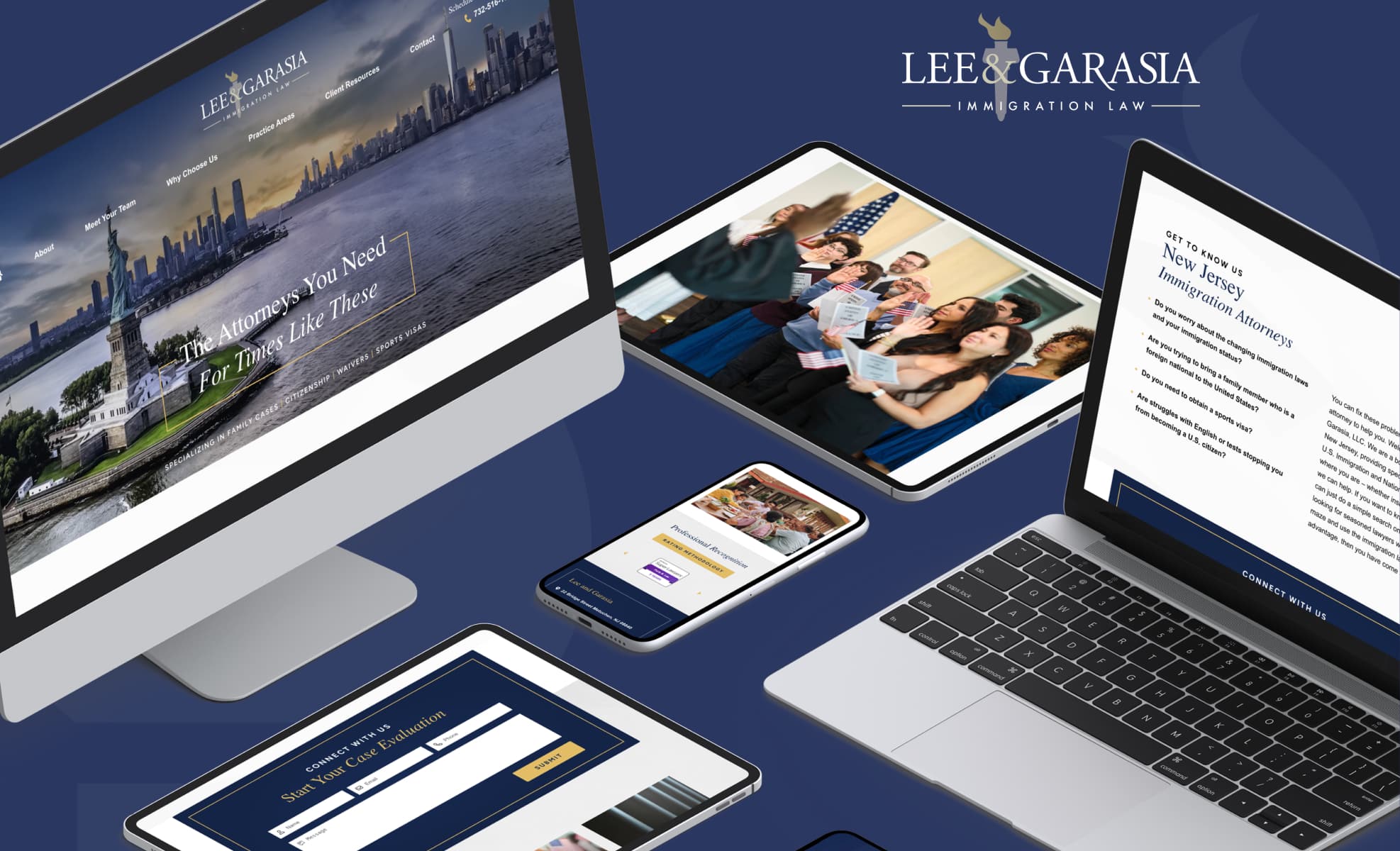
This New Jersey immigration firm’s site captured the top spot with a dynamic, colorful hero carousel that perfectly captures the firm’s location and allows visitors to see themselves represented in images of the firm’s target clients. This website perfectly captures what users of the site need: it makes things easy with an uncluttered look and straightforward navigation, and makes them beautiful with simple, elegant design elements.
#2 Bloom Family Law, PC

This California family law firm takes a genuinely holistic approach to its clients’ well-being. Everything about the law firm website design points to that, from the rounded shapes and warm imagery throughout the site to the muted color choices and botanical design elements. The firm’s brand is about helping women grow and bloom, and the website captures that personally.
#3 The Law Office of Poorvi B. Parkhie

A single glance at this custom website for a Colorado law firm tells you a lot: the logo and homepage design convey its location; its prominent tagline, “Your Partner in Business,” assures visitors of what to expect from the practice. The eye-catching use of circular shapes, fluid lines suggesting mountains, and pops of muted red against the navy-and-white color scheme makes this site (and firm) stand out from the pack.
#4 Zammitti Shaw & Breen

The attorneys in this New Jersey personal injury firm aren’t afraid to be bold, in court or in their presentation. They are unapologetically themselves, and their law firm website features them prominently: hot pink fashion choices, impressive results, and all. This site is an impressive blend of both form and substance.
#5 Aspen Estate Planning
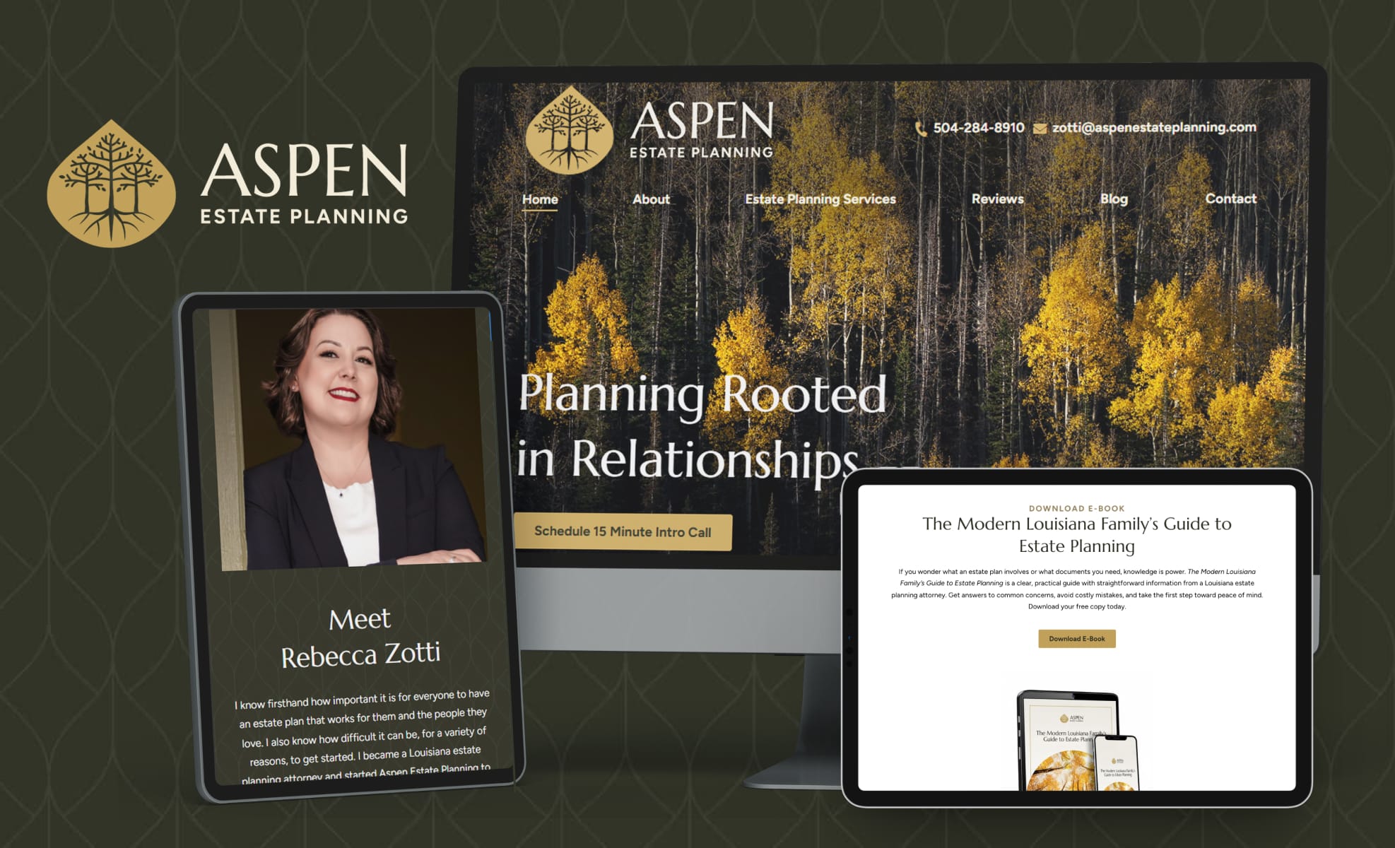
Aspen groves have interconnected roots that provide stability, much like a comprehensive estate plan protects a family. We carried that imagery throughout the site, including breathtaking imagery, font, and color choices throughout the site that echo that branding. The site’s content, written by one of TMF’s attorney writers, further reinforces the brand.
#6 Law Office of JL Hawkins, PLLC
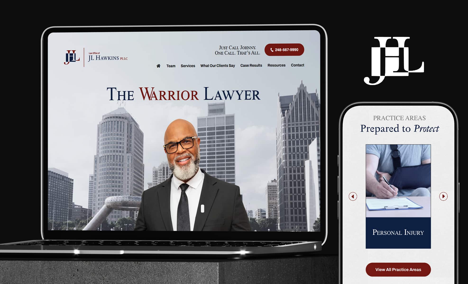
The website for this solo Metro Detroit personal injury practice showcases a friendly image of the attorney against a black-and-white backdrop of the city he serves. In firms where the attorney is the brand, we love a site like this that lets their personality shine through in imagery and content, with subtle design elements that add polish but don’t distract from the site’s message.
#7 Wegner Law PLLC

The Modern Firm incorporated this Texas bankruptcy law firm site’s elements distinctive logo throughout the site, including using the design as a background on the homepage and incorporating the welcoming yellow and green colors into imagery, print, and design elements in a tasteful way that pulls the site together visually and makes it warm and inviting.
#8 Lothstein & Guerriero, PLLC

The website for this New Hampshire defense firm with deeply-experienced, award-winning attorneys is notable not only for its crisp appearance and seamless navigation but its organization of huge amounts of substantive content. It gives visitors plenty of resources while remaining visually appealing rather than overwhelming.
#9 Cermak & Inglin, LLP

This site for a California-based environmental law firm stands out for its use of colors and imagery that represent its practice focus in an innovative way. We particularly like the modern impression created by design elements like double lines and bullet points that echo the logo. These seemingly minor details come together to create a cohesive image.
#10 Native Law PLLC
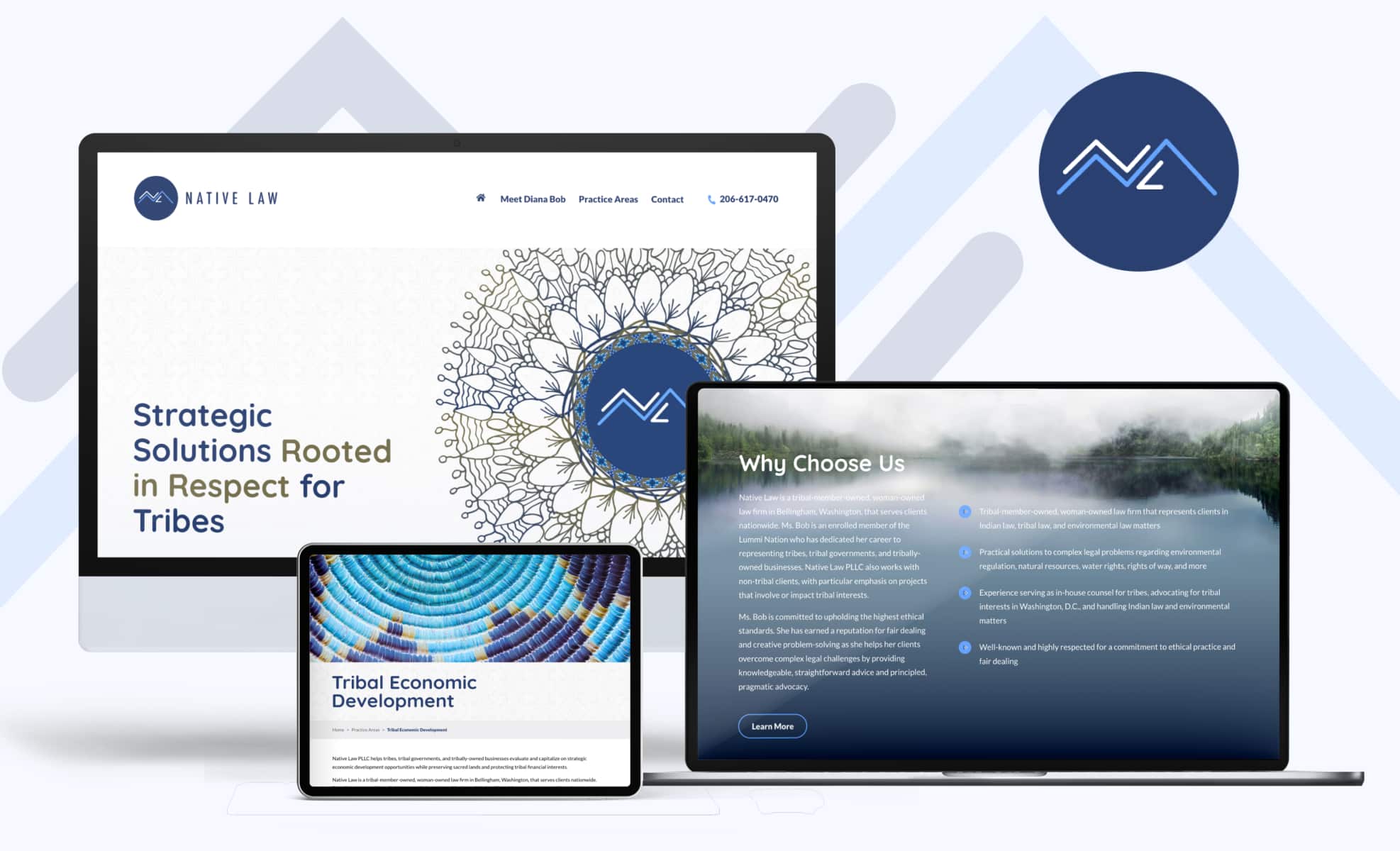
This Washington-based firm serves tribes, tribal governments, and tribally-owned businesses nationwide. We appreciate the way the site employs elements of native art in a respectful way to not only highlight the firm’s practice focus, but to add visual interest throughout the site, such as the subtle patterning in headers and footers. This site is another example of how a conservative color scheme can be anything but boring with the right design elements.
#11 Busch IP Law
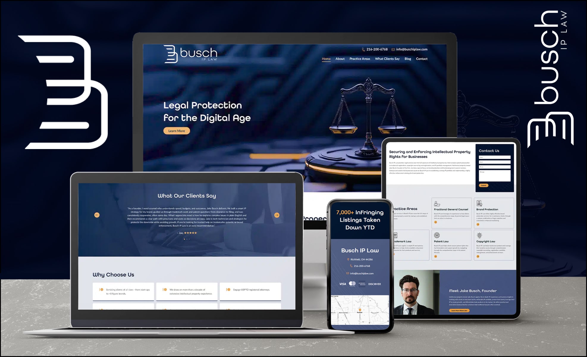
The right logo can set the tone for a law firm’s website and branding, and that was the case with this Ohio intellectual property law firm website. The custom logo and font choice evoke the cutting-edge feel an IP firm website should have, and the hero image and striking color choices convey both modernity and stability.
#12 Scarbrough & Scarbrough PLLC

Blue and white can be conservative color choices for a law firm, but they don’t have to be. This custom website for a North Carolina land use law firm was a team favorite for its eye-catching, vibrant hero image of a topographic map in gradations of blue, against which the tagline, “Clearing Your Path to Success” pops. Both are clever nods to the firm’s practice focus.
#13 Trusts & Estates Group
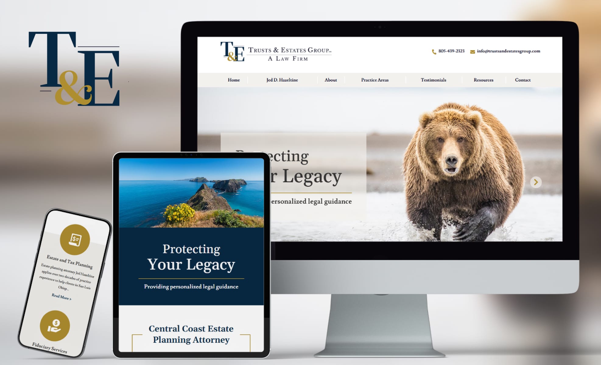
Our team members were captivated by the hero carousel featuring breathtaking images of California’s natural beauty on this San Luis Obispo-based firm and the similar imagery echoed more subtly in footers and backgrounds throughout the site. The site also got high marks for the clarity of the practice area tiles on the homepage, aiding navigation.
#14 Saka Bryant, P.A.
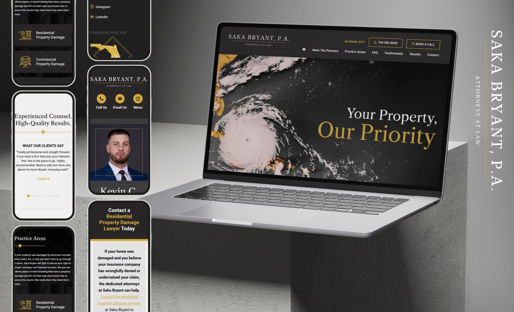
Saka Bryant is a Florida property damage law firm. We love the sense of urgency that the website’s hero image (a satellite image of a hurricane bearing down on the peninsula) evokes, and the way the website’s rich gold, black, and white color scheme suggests seriousness and strength. Visitors to the site get the clear impression that these attorneys can help them find control after chaos.
#15 National Logistics Mediations
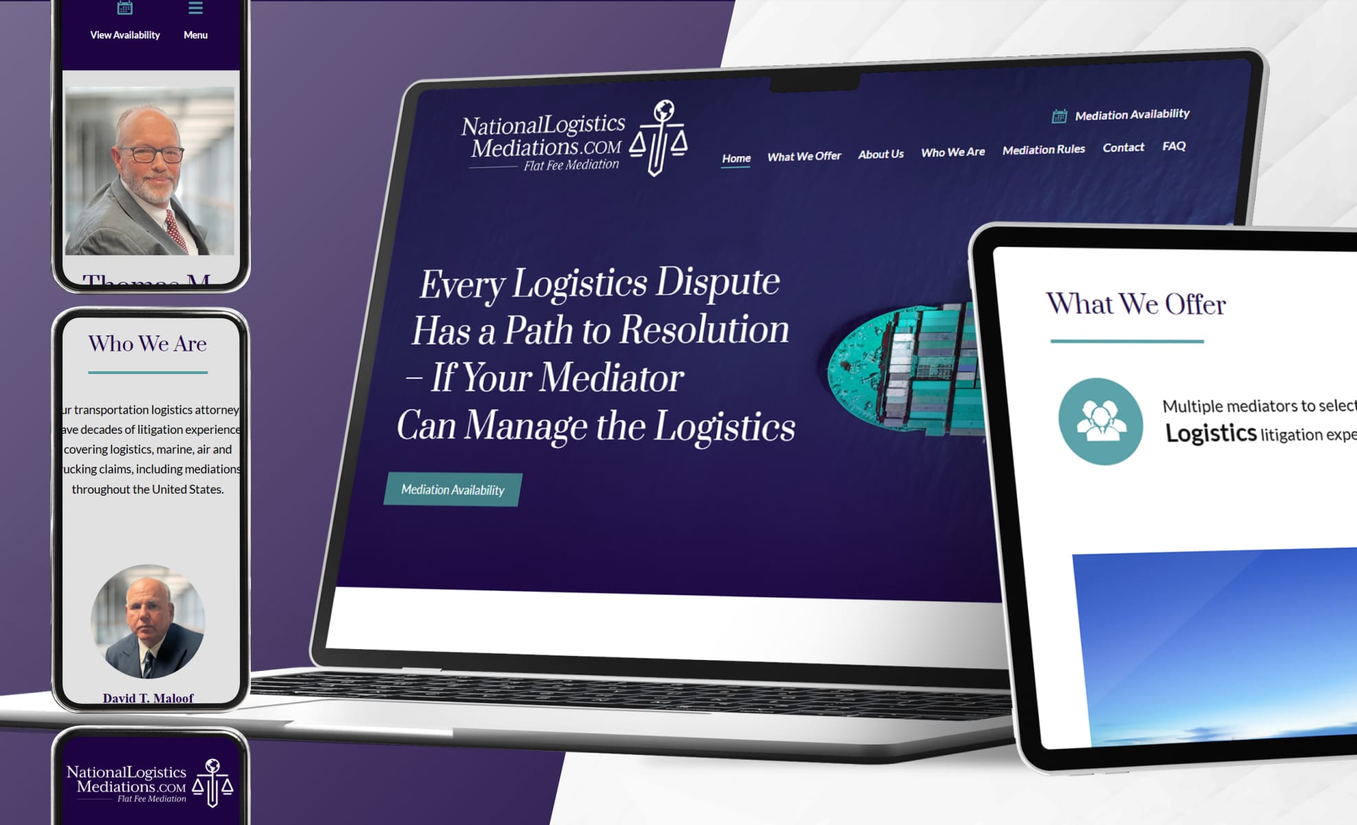
This logistics mediation firm is another with a niche practice, and the website does an amazing job of appealing to the practice’s target audience. The site is easy to navigate and clearly targets the logistics professionals who can benefit from their services. Everything about the site is a nod to these attorneys’ maritime and transportation sector knowledge, including the striking imagery and crisp blue, teal and white color scheme.
#16 Kingree Law Firm, S.C.
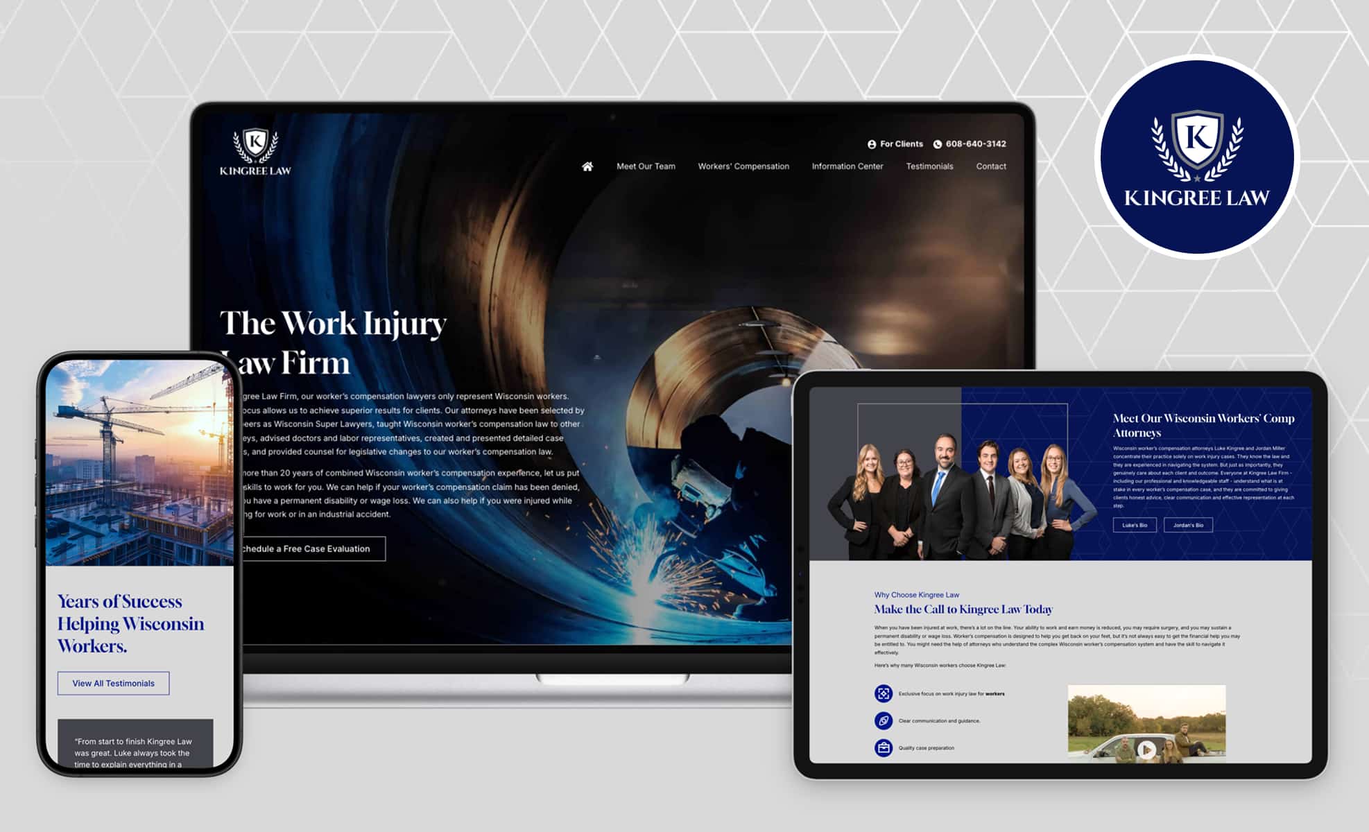
This practice is building a reputation as the go-to firm for work injuries in Wisconsin, and we love how the site conveys the firm’s modern, authoritative brand. Favorite features include the use of light, line, and color in the hero image of a welder; it artfully conveys the firm’s focus. We also love the extensive resources the site makes available (and convenient) for the firm’s target audience, positioning the firm as a knowledgeable authority.
#17 The Van Dora Law Firm, LLC
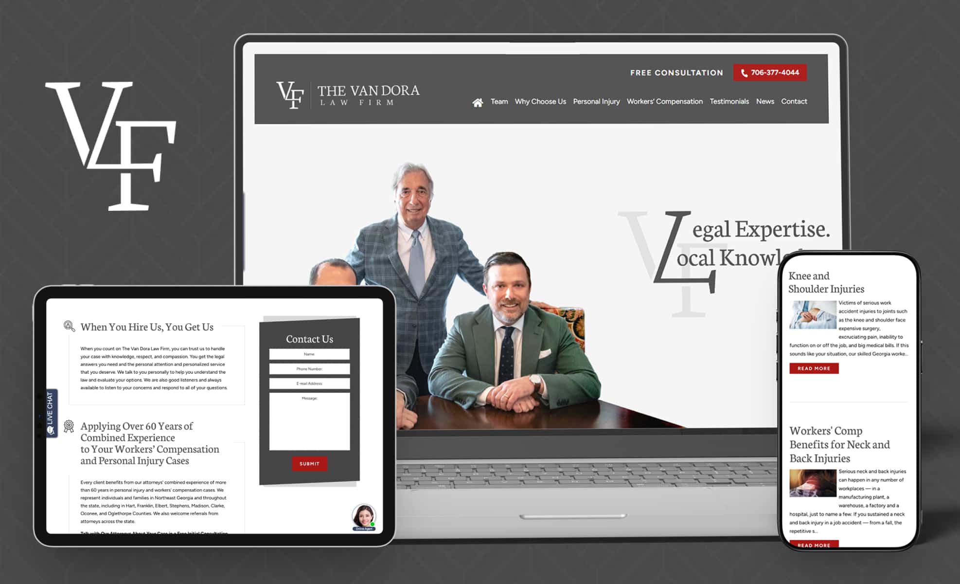
With a focus on personal injury and workers’ compensation, this Georgia law firm leans into its local, family-owned brand to evoke trust and distinguish itself from competitors. The use of subtly-patterned backgrounds and the use of the conservative charcoal and crimson color scheme in surprising ways throughout the site makes it feel steady and reassuring, but also modern and fresh.
#18 Johnstone Law PLC
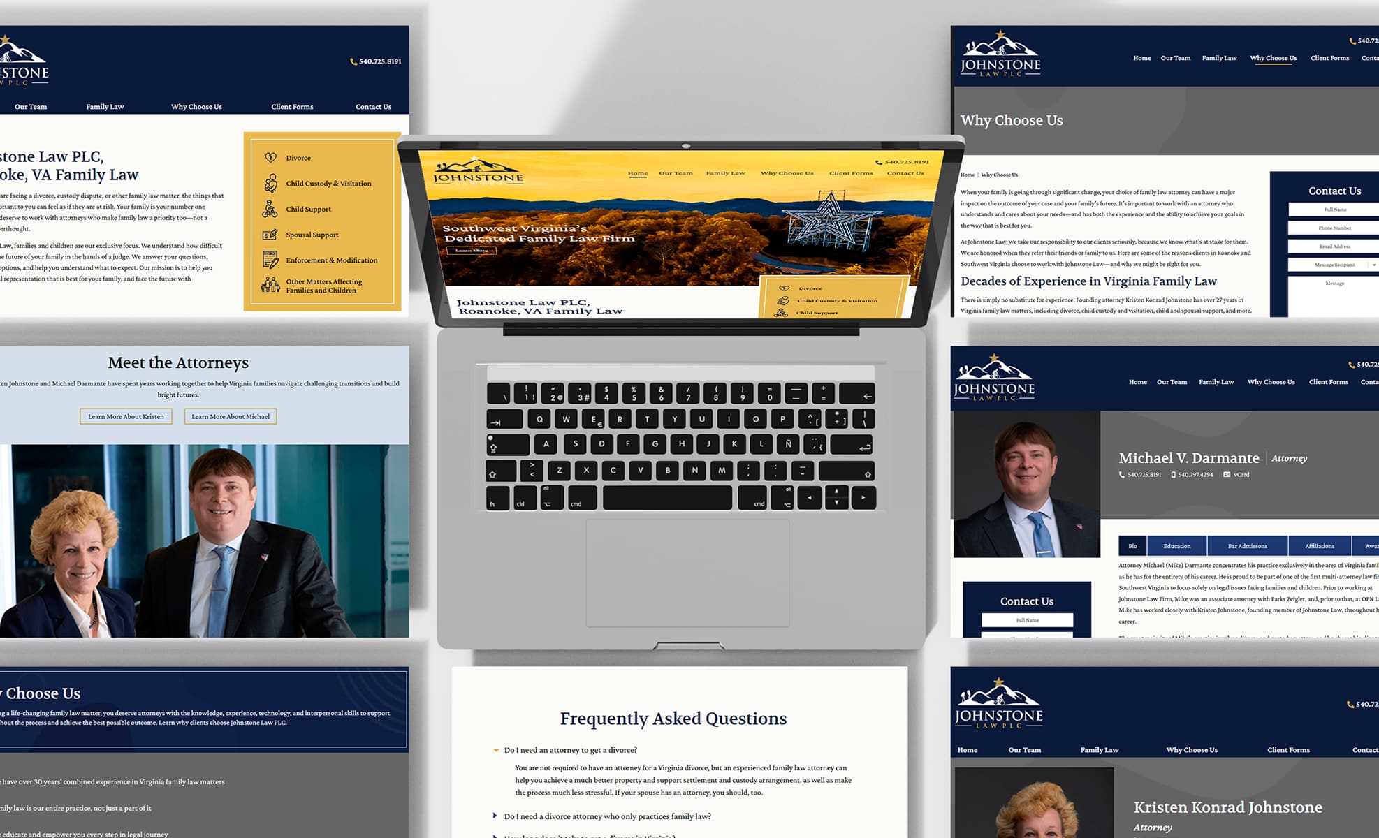
This Roanoke, Virginia firm bills itself as “Southwest Virginia’s Dedicated Family Law Firm. Its homepage features a sweeping view of the Blue Ridge Mountains in the background with Roanoke’s iconic star in the foreground. The site’s imagery and content perfectly showcase not only what the firm does, but the specific community in which they do it. The distinctive blue and gold color scheme is striking and unifies the entire site.
#19 Olvera Hall & Sillers, PLLC
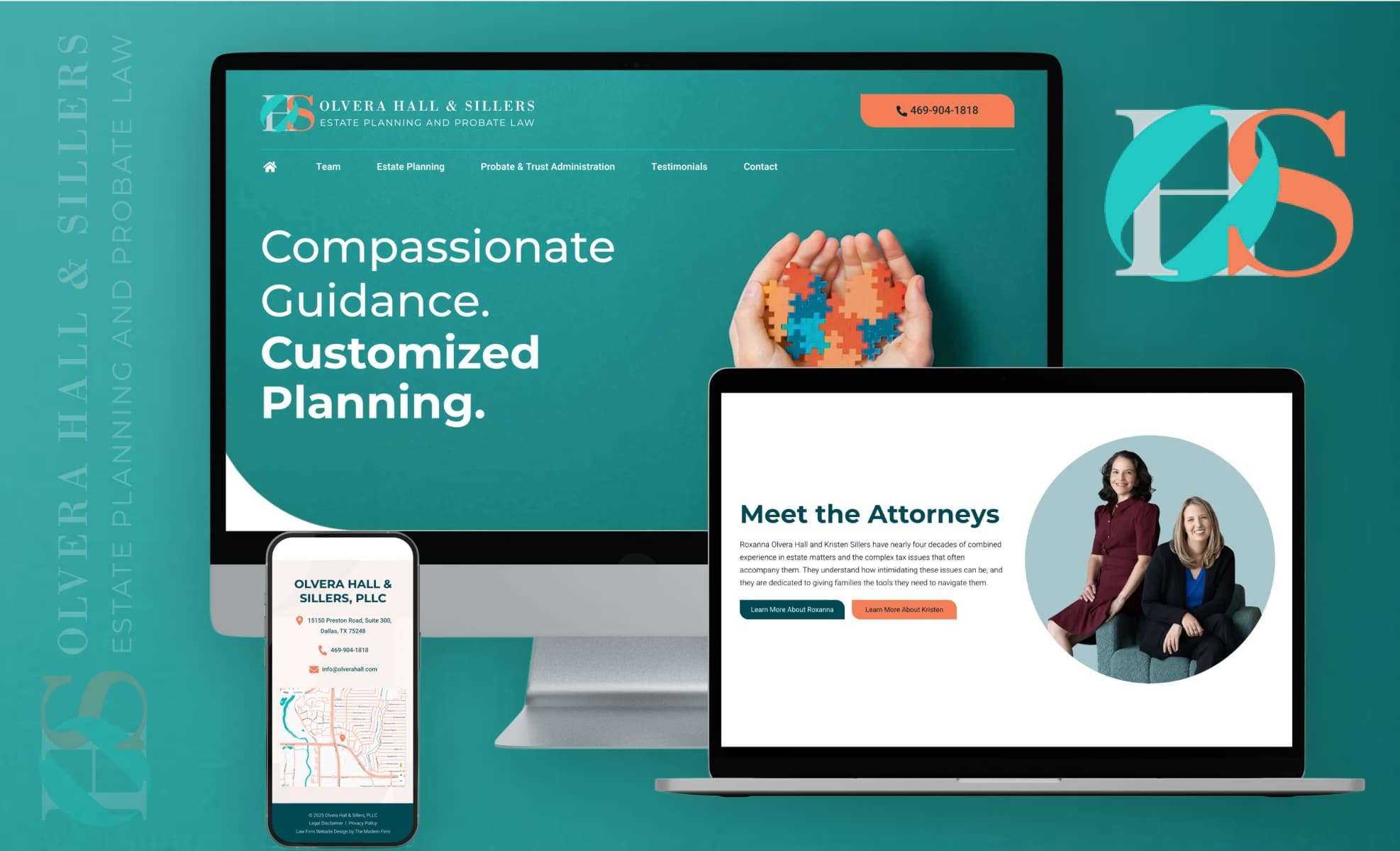
This Dallas, Texas, estate planning and probate firm has familiar practice areas and an unforgettable look. The attorneys’ choice of vibrant colors is echoed throughout the site, conveying a warmth and cohesiveness that is naturally appealing. Everything from the logo to the taglines to the carefully-crafted copy conveys the firm’s client-focused brand.
#20 Law Offices of Jackie L. Russell, PLLC
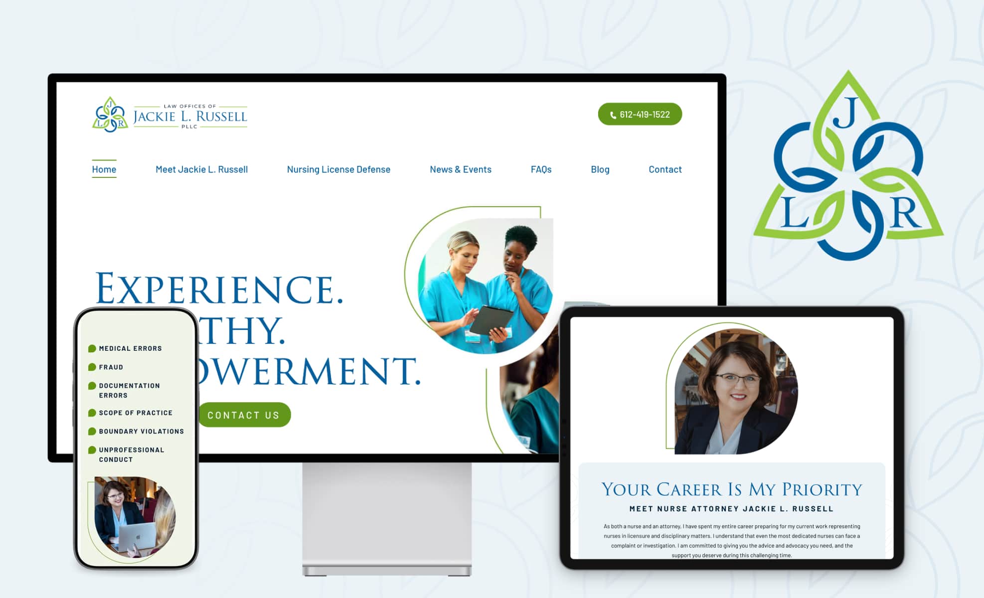
Designing a website for an attorney with a niche practice area is always fun and challenging. Jackie Russell is a nurse and attorney who focuses on Minnesota nursing license defense. We ran with Jackie’s logo, incorporating the shapes and colors into a site that evokes Jackie’s reassuring demeanor and made the nature of her practice instantly clear.
Want to Make the List?
The practices on our list of best new law firm websites span the country and cover a broad spectrum of practice areas; they range from understated to bold in their design choices. What unites them is their awareness of what makes them unique, and their commitment to conveying their brand effectively through their website.
Taking the time to get to know our clients enables us to help them showcase what makes them special on a website that not only looks good but functions seamlessly. If you’re ready to partner with a team that’s focused on helping your firm shine, let’s talk.